An explanation behind the redesign of the 4th edition of BiSL.
Bella Design Studio was asked at the end of 2023 to collaborate on the BiSL redesign: a completely new book design and cover design for the 4th edition of BiSL, published by Van Haren Publishing.
BiSL is a best practice (management approach) for business information managers. The method has been widely used since 2005 (you can find a chronological overview of the field and the BiSL books here).
What is BiSL (in plain language)?
Imagine that a school has a big box full of toys for all the children. To make sure everyone knows which toys are there, how to play with them, and that they stay tidy and intact, there is a special toy manager. BiSL is like such a manager, but for the information on computers and the internet within companies.
BiSL ensures that all the information a company needs is well organized, easy to find and use, and also secure. Just as the toy manager makes sure the toys remain fun and safe for everyone. In this way, BiSL helps companies take good care of their 'information toys', so that everyone can do their work well and comfortably!
What were the needs behind the BiSL redesign?
The BiSL model has had several updates since 2005, but in essence it is still the same model. That is precisely the strength of BiSL: it remains easily recognizable as a result.
Over the years the model received a new visualization now and then, but it still looked somewhat outdated. The main assignment for this redesign was therefore to give BiSL a fresher look.
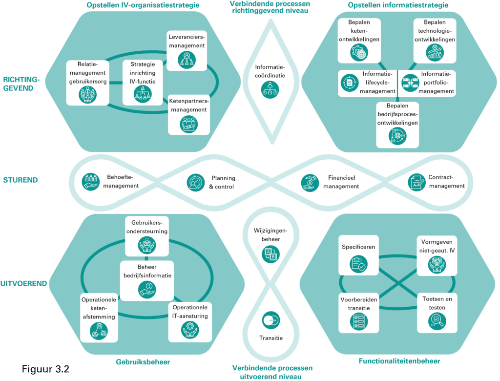
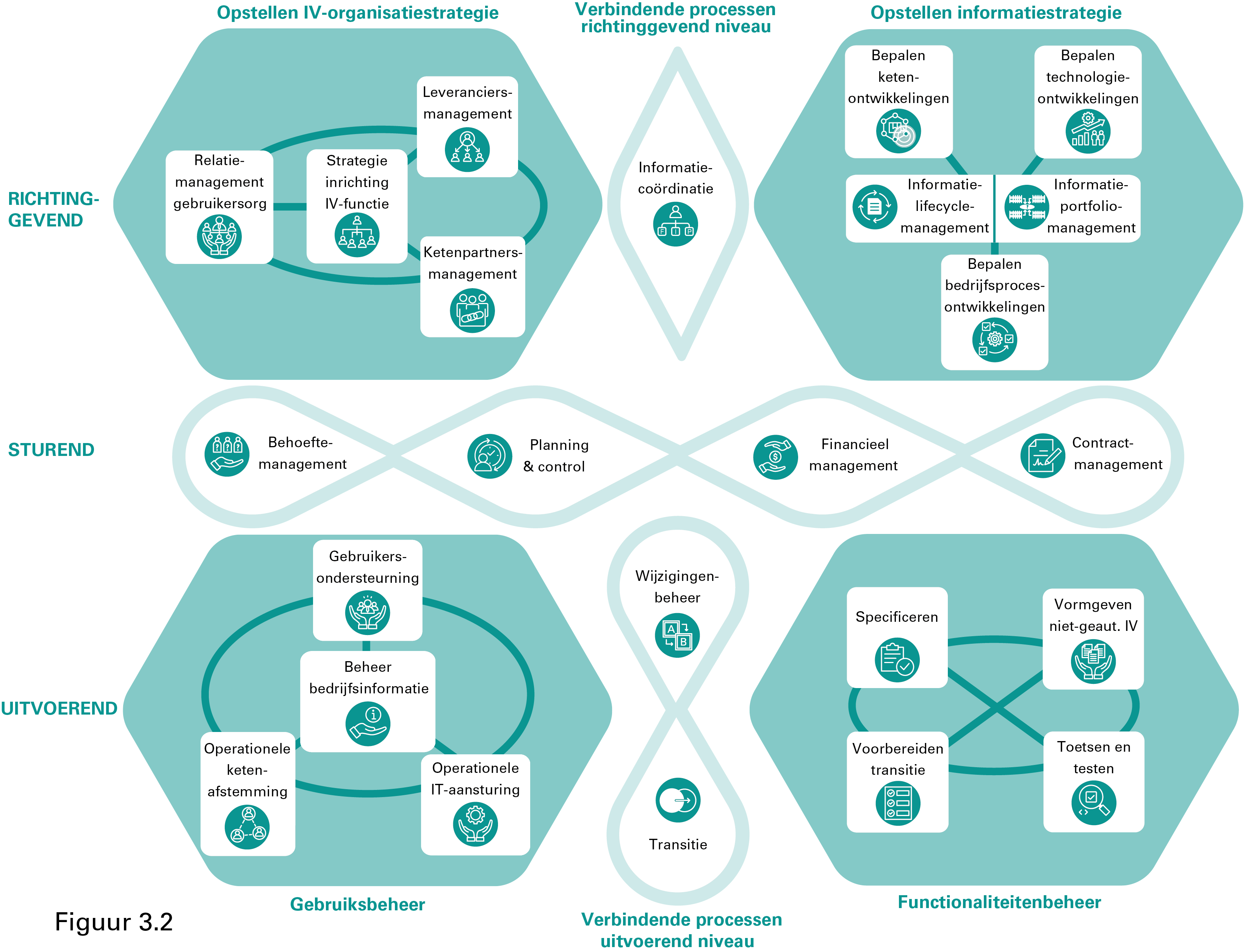
This was achieved, among other things, by bringing more flow and continuity into the model, and by making it didactically stronger with icons that visualize the various areas of focus. This also makes it easier for students to understand and remember BiSL.
Initially, a number of colors were used. Ultimately, however, it was decided to align the color scheme with the BiSL logo and with the color of the model from the heyday of BiSL (around 2014). That color is, understandably, turquoise green.
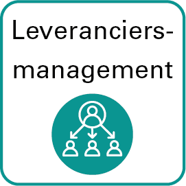
In addition, there was a need to better represent the various areas of focus, apart from the icons, and to give the entire model a fresher look. Below is an example of the supplier management icon.
What choices were made in the redesign of BiSL?
Softer corners
As connoisseurs will immediately notice, the hard corners have been removed from the model and from all the images and made softer. This gives the model a fresher character and makes it less harsh. The softer corners also look somewhat more refined in style.
Cycles instead of blocks
In line with the rounded corners, all the blocks and square lines have been replaced by round, cyclical shapes. This gives the processes a more continuous character and illustrates more flow in the model and the information streams, instead of 'hard' big-bang transfers between the various phases and process steps.
Highlighting levels against the background of the model
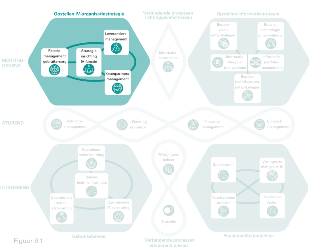
We chose to bring the full model back in the various chapters of the book. In the previous edition, the full model appeared only once, in the appendix. Now we bring the model back at full size each time, but we only highlight the relevant topic by making the rest of the model more transparent, as in the example below.
Icons in a contrasting frame
The icons have been placed in a contrasting white frame. This brings calm to the model and space to clearly write the description of the relevant icon alongside it. This way you don't have just an icon and not just text, but the best of both worlds.
Good luck with the BiSL redesign!
If you are a user of BiSL or are about to become one, then I hope you greatly enjoy the renewed BiSL model. This article explains the choices we made in the book design and cover design. I hope the intended objectives are achieved and that you derive much pleasure and benefit from it.
Leave a reply Cancel reply
Your email address will not be published. Required fields are marked with *
Name *
Email *
Website
Comment *
Save my name, email and website in this browser for the next time I leave a comment.
Other topics
Corporate identity (2) Case study (2) How-to guide (1) moodboard (2)